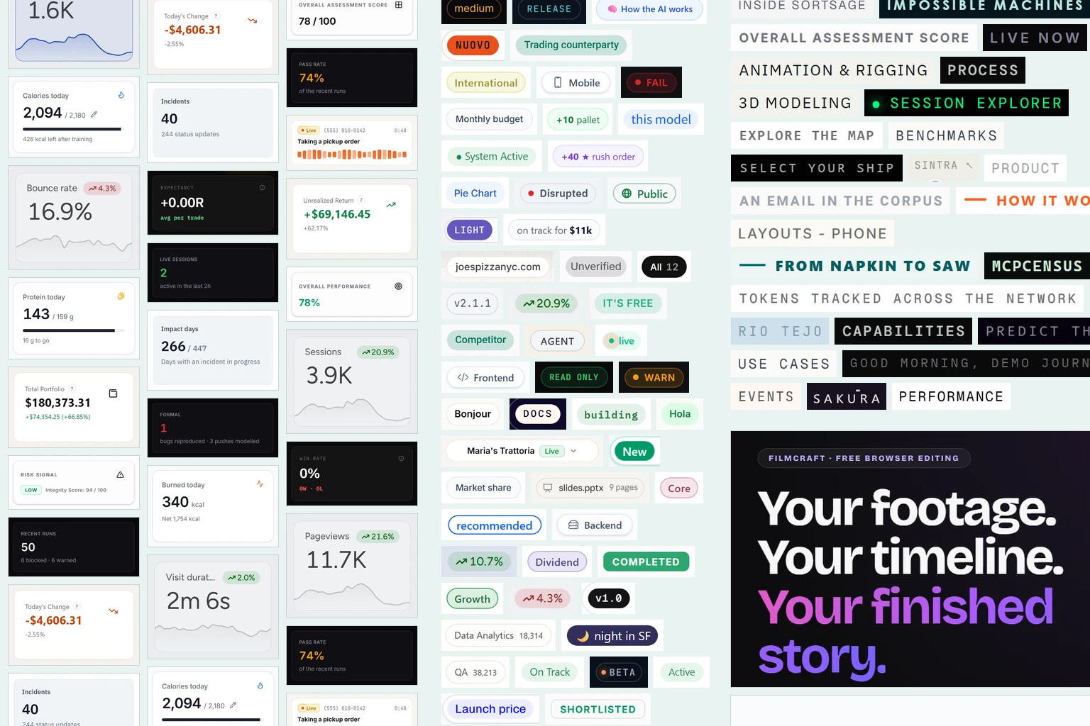
Don't delegate taste
I’m definitely not a designer. I am practical: if it works, it works. But lately, I started seeing so many AI-designed sites and dashboards that my brain just says “AI AI AI -> B-tier work”. Just like the infamous em-dashes.
AI today makes it possible to create a lot of fancy, shiny, incredible tools, but what everyone notices is that LLM-generated UI also follows specific patterns. And I’m not here to critique prototypes and projects that without AI would probably not exist. Creating UIs is HARD and it matters a lot in demos: most of the prototypes I spin up look like this.
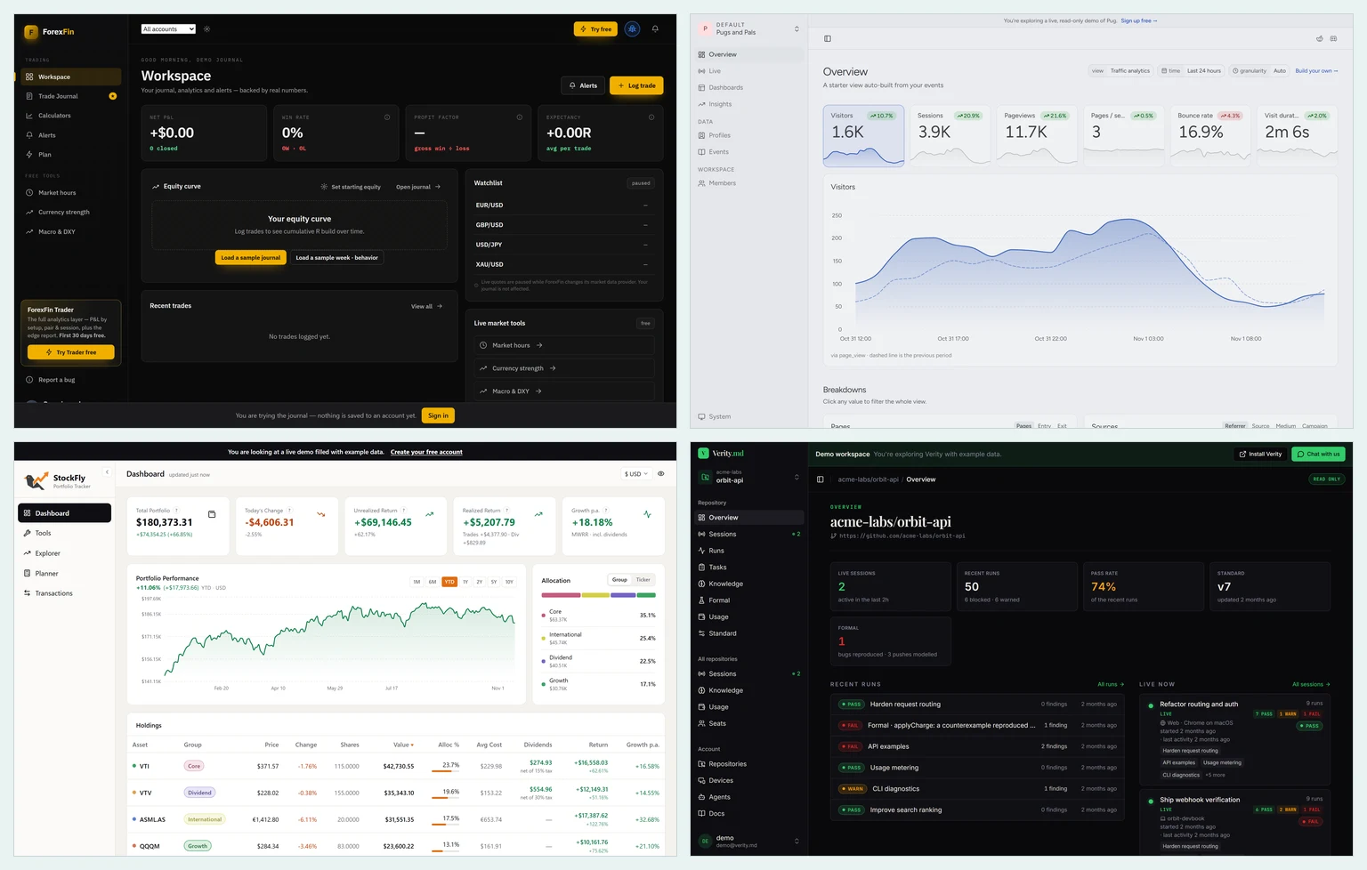
The AI layout: sidebar, a row of KPI cards, a chart below. Sources: forexfin.tech, pug.sh, stockfly.app, verity.md
What is the problem then? I see two:
-
If everyone is following the same pattern, this becomes something we immediately associate with slop. It’s generic, boring, and everyone can create it in 2 prompts. Do you want your work to be linked to that? I took great care in designing my website to feel a bit unique and “handmade”: of course I used Claude to help me with Astro internals and lots of CSS tricks, but I don’t want people to judge what I write by hand based on “slop signals” in the design.
-
More importantly, in interactive tools like dashboards, AI UIs often don’t follow best practices. There are tons of UI smells, like long, basic text explanations scattered around the interface, inconsistency, wrong colors, no accessibility. This makes the experience ugly and frustrating for users.
What can we do about that? You can learn!
DO NOT DELEGATE TASTE.
👉 AI has no taste. 👈
It’s you, unique and amazing human being, who can add your experience, your craft, and your sense of aesthetics to deliver something that is beautiful and works.
Of course, there are skills like Impeccable that can audit and clean your UI. In my experience, they help a lot, but slapping a skill on top is a patch to a deeper issue. It’s like a linter: it fixes what’s wrong, but it doesn’t teach you why it was wrong, and it misses the more nuanced decisions. Plus, Impeccable-patched websites still look the same once you start noticing them.
Follow a UX/UI course (I took Shift Nudge, but you can find many free resources on YouTube). Ask for feedback on your frontend. Or ask your users. And presenting your work in a more aesthetic way, with minimalism, will help you grow because you can apply the same lessons to presentations/slides and visual communication in general.
I also collected a little list of “AI UI smells” my tired brain sees (as of October 2026)
Dashboards
Same card, same 12px radius
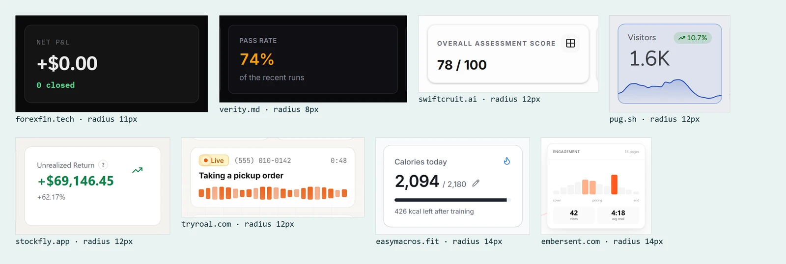
Sources: forexfin.tech, verity.md, swiftcruit.ai, pug.sh, stockfly.app, tryroal.com, easymacros.fit, embersent.com
Everything is a pill

Sources: verity.md, pug.sh, stockfly.app, tryroal.com, boilerroom.ai, easymacros.fit, embersent.com, swiftcruit.ai, deepsql.ai
Tiny uppercase labels everywhere

Small, gray, letter-spaced uppercase labels on top of every number and every section. Hard to read, and they add noise without adding information. Sources: forexfin.tech, verity.md, swiftcruit.ai, tokenmaxxer.xyz, agentwatch, embersent.com
Cluttered card details
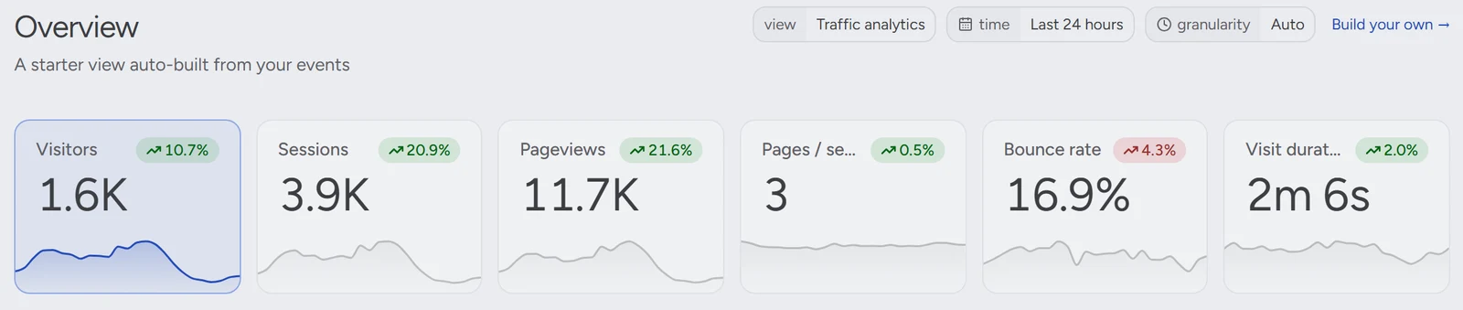
Every KPI gets a percentage change and a tiny chart. Compared to what? Over which period? Usually it doesn’t say, and the labels get truncated to make room. Source: demo.pug.sh
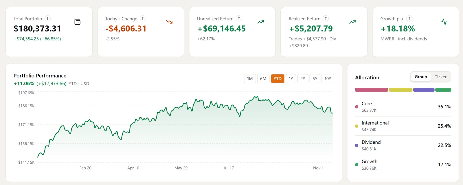
Source: stockfly.app
Inconsistent data
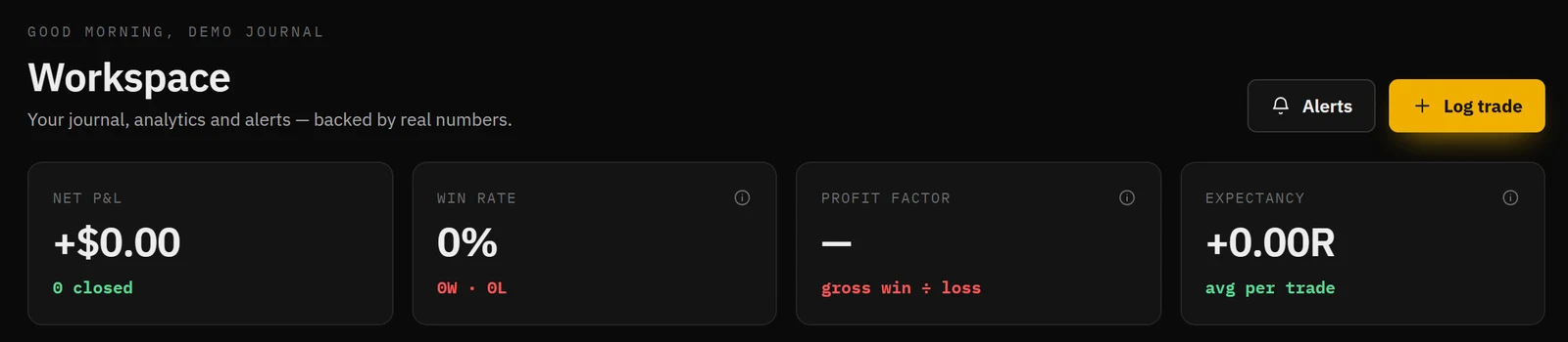
This account has zero trades, but the dashboard still shows +$0.00 in green, like a gain. Source: forexfin.tech
Duplicated data

78 / 100 and 78% are the same number, shown as two separate KPIs. It tells you nothing new. Source: swiftcruit.ai
The vanity number
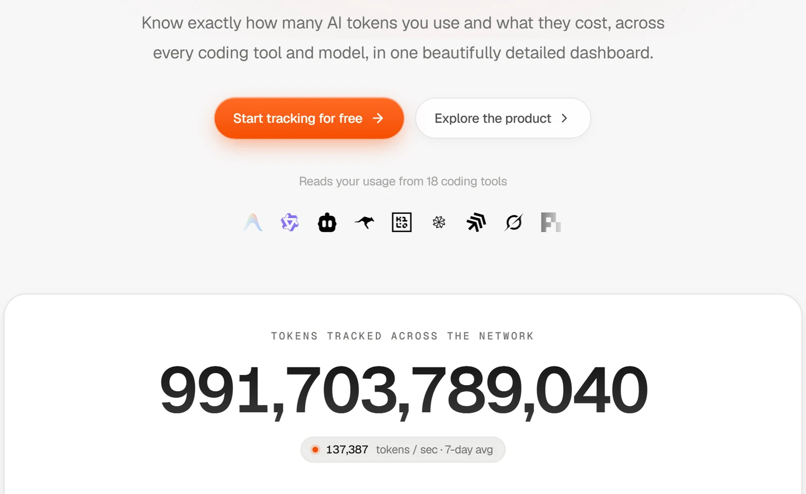
A giant counter. Which decision would you make with it without context? Source: tokenmaxxer.xyz
Landing pages
Three-beat headlines
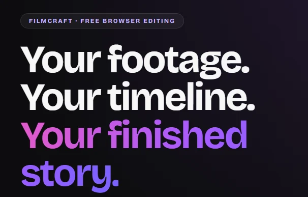
Source: filmcraft.tools

Source: fundstash.app
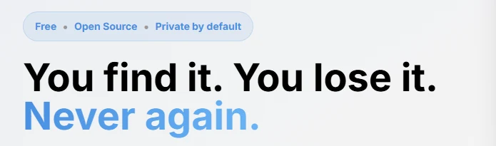
Source: rocus.io

Source: pulseos.finance
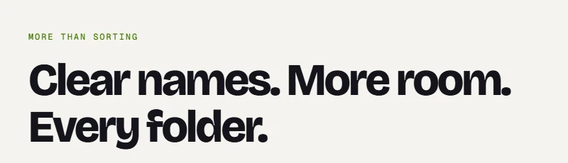
Source: lisorto.app
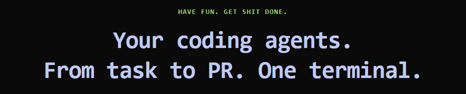
Source: craig-cli.com
The gradient (or italic) accent word

Source: chitra.studio
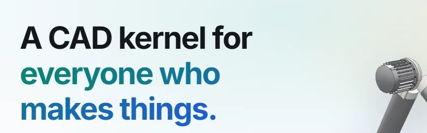
Source: popkern.dev
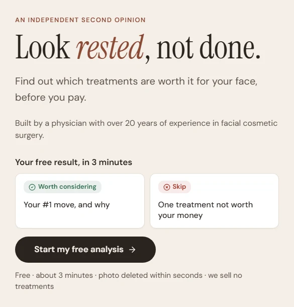
Source: mymirrormd.com
The eyebrow label
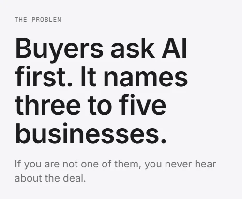
Source: aiknowsus.com
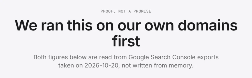
Source: aiknowsus.com
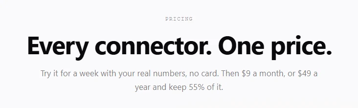
Source: notchmetrics.com
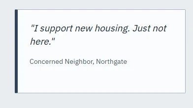
Cards with a thick left border

Source: agent-alley.com
Source: permit.petercai.com
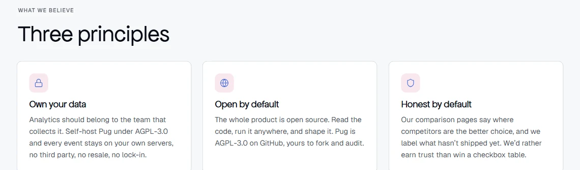
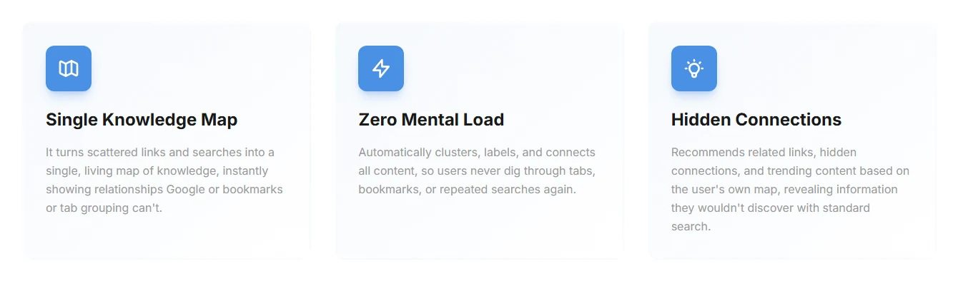
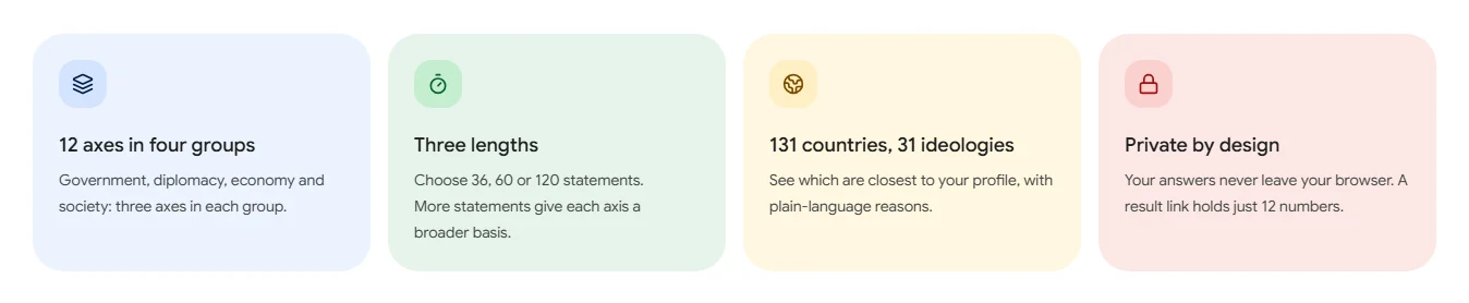
The icon tile grid
Source: pug.sh
Source: rocus.io
Source: 12axestest.org
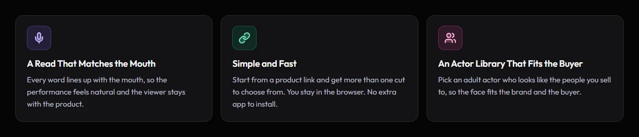
Source: aivideosugc.com
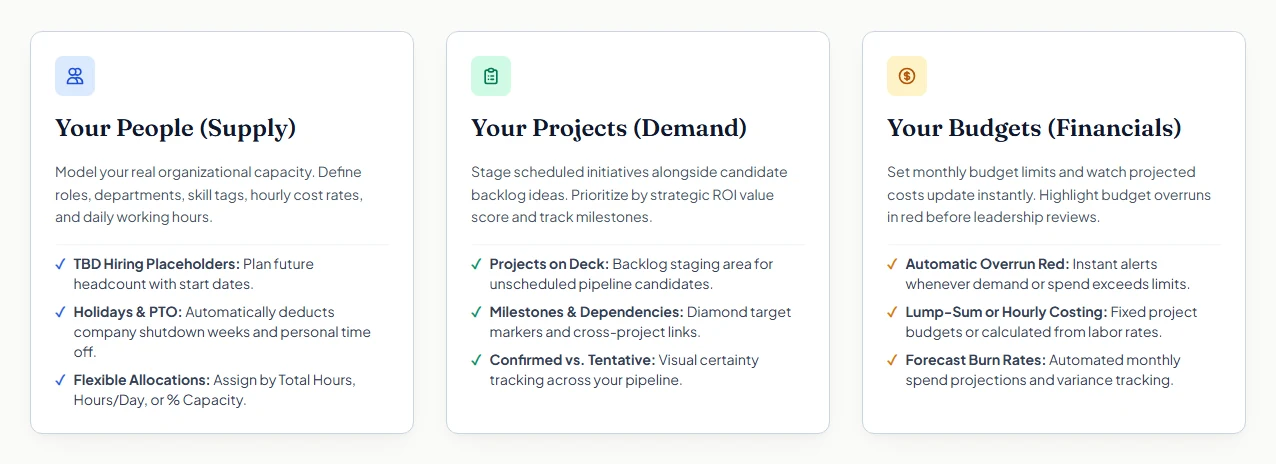
Source: resourcedeck.app
Numbered “How it works” steps
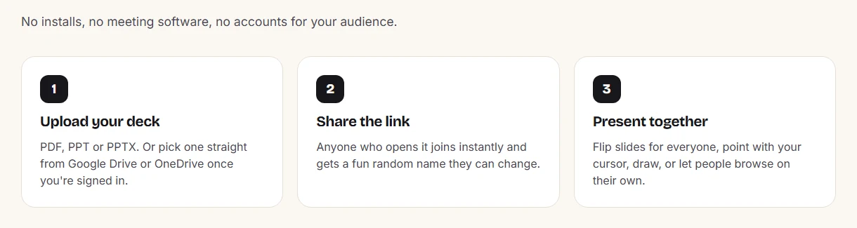
Source: slidebyside.com
The glowing/gradient button

Source: aivideosugc.com
Source: alt-tabr.com
The pill above the headline
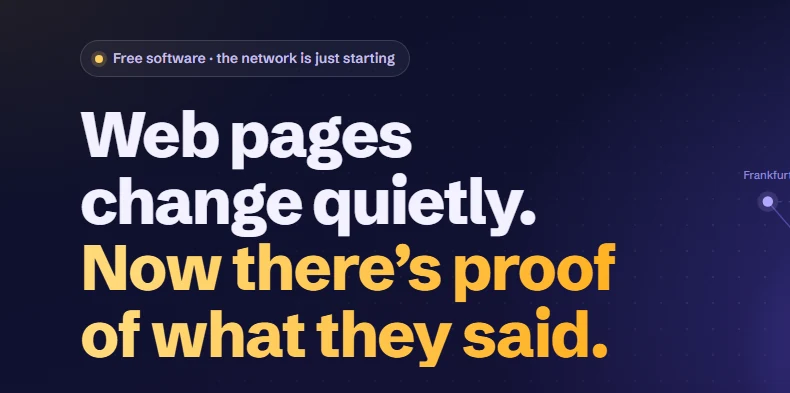
Source: keepword.net
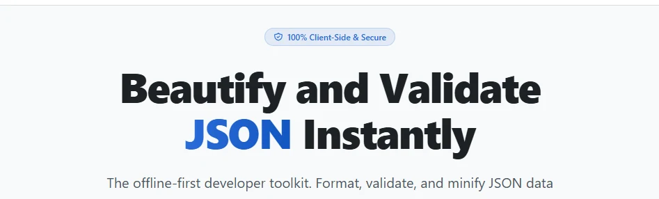
Source: instantjsonformatter.com
Acme, Northwind and Maria
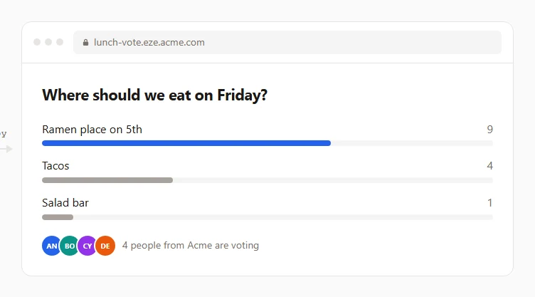
Source: eze.page
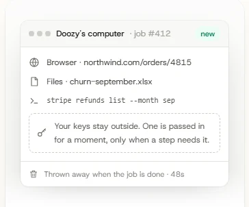
Source: askdoozy.com
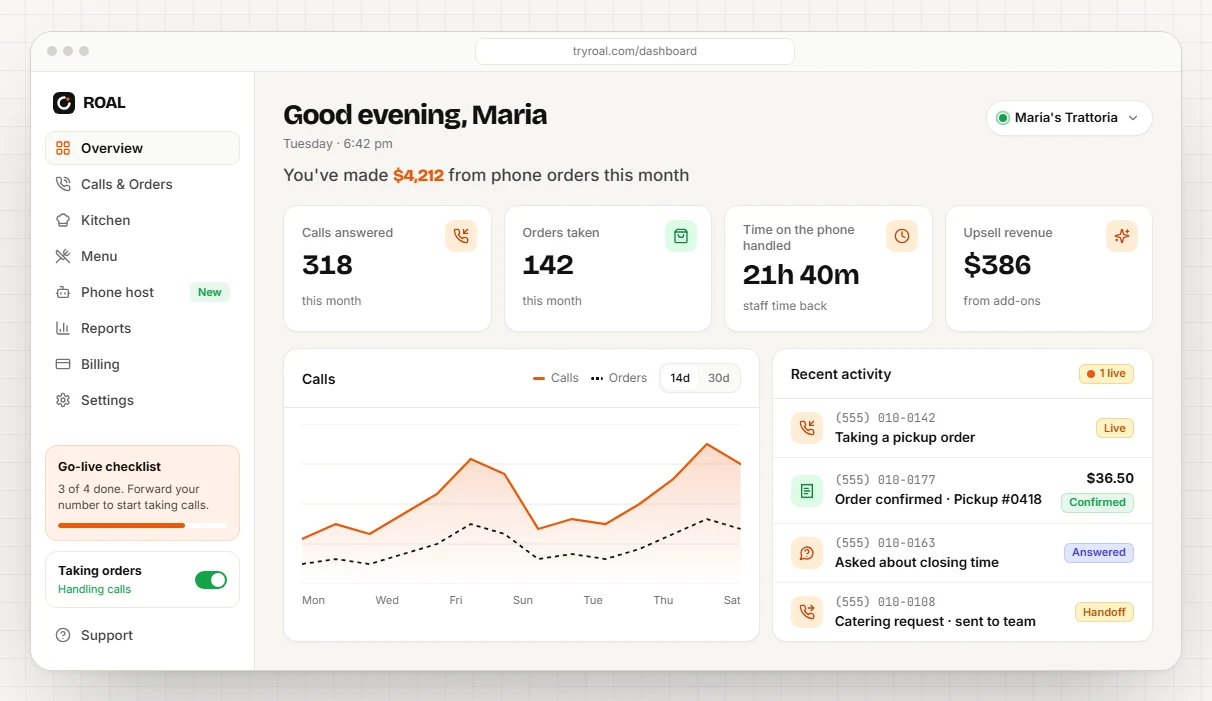
Source: tryroal.com
Copy
Saying it twice

Source: chitra.studio
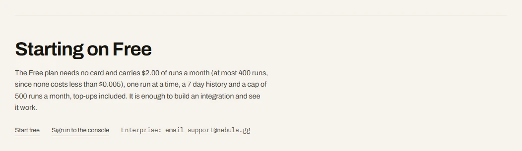
Source: fastbrowse.ai